
Trends


Trend analysis is reading a series of measurements taken over time to work out which way the thing is actually moving, and how fast. You take one metric recorded at a fixed interval, get enough history to cover at least two or three full cycles, split what you see into the long-run direction, the repeating seasonal pattern and the random noise, and then measure the direction in a way you can repeat next month.
That last part is where most people lose. A number on its own is not a trend. Below is the method in five steps, worked end to end on a real search term that is genuinely growing, then run again on one that looks like it is growing and is not.
Key takeaways:
Let's get into it.
A trend is the underlying direction of a series once you have taken out everything that repeats and everything that is random. Trend analysis is the set of steps that gets you to that direction, and to a number you can defend.
It shows up under different names depending on the room you are in. Statisticians call it time series analysis. Accountants call it horizontal analysis when they run it across financial statements. Market researchers call it market trend analysis when the series is demand rather than revenue. The arithmetic underneath is the same.
The National Institute of Standards and Technology sets out the framing in its introduction to time series analysis: a series is treated as components to be identified and modelled, not as a single line to be eyeballed. Three components matter for almost every practical question.
Mistaking the second for the first is the expensive error, and it is the one this guide is built around.
Most articles on this keyword give you a list of trend types. There are really only two dimensions, and every list is a combination of them.
By direction, which is the classic three:
By horizon, which is what people usually mean when they say "types":
The same series can be rising long-term, falling short-term and seasonal all at once. That is not a contradiction. It is the normal case, and it is why the answer to "is this a trend" always starts with "over what period".
Here is the whole method before we work through it.
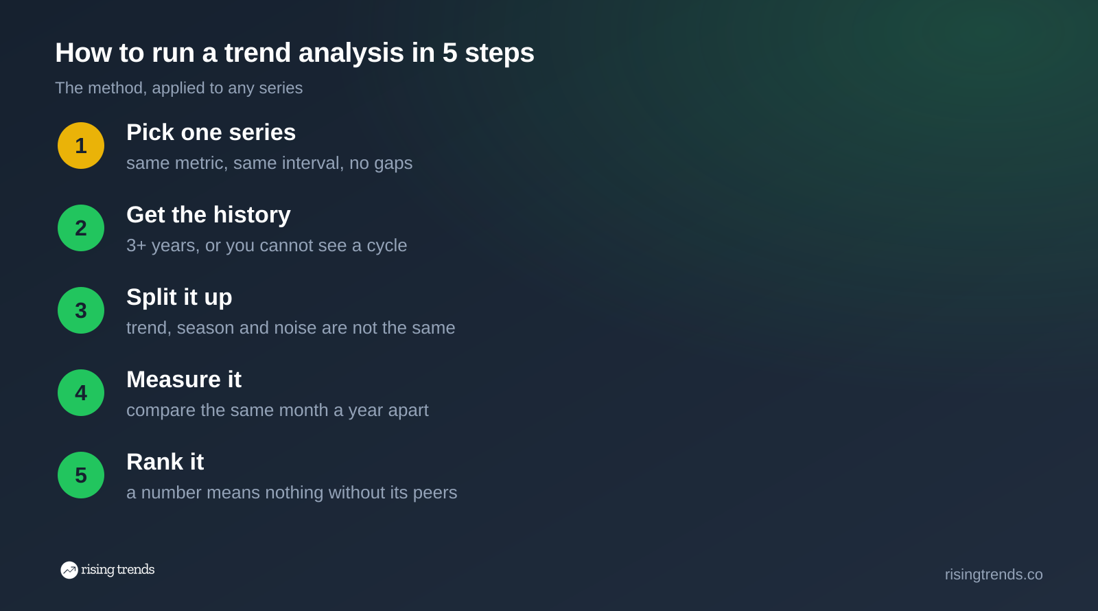
Each step removes one way of being wrong, in roughly the order that catches people out.
A series is one metric, recorded at one fixed interval, with no gaps. Monthly US searches for a single phrase. Weekly units sold of one SKU. Quarterly revenue from one segment. The moment you mix two metrics or two intervals, nothing downstream is comparable.
Minitab's first-party guidance on data considerations for trend analysis is blunt about the two things that go wrong here. Record the data in chronological order, because out of order you cannot assess time-related patterns at all. And collect enough of it: enough, in their words, "to be sure that any pattern you observe is a long-term pattern and not just a short-term anomaly".
For monthly data that means three years minimum. Two full cycles tell you a pattern exists. The third tells you it is reliable.
For the worked example we are using one search term: creatine monohydrate monthly search volume, which runs from November 2018 to August 2026. That is 94 monthly observations of the same metric, which is more than enough.
One note on where demand data comes from, because it decides whether step 4 is even possible. Google Trends does not give you counts. Google's own FAQ about Google Trends data explains that each point is divided by the total searches for its geography and time range, then scaled 0 to 100. That is an index. You can read the shape off it, which is genuinely useful and free, but you cannot do arithmetic across two charts, and a small term reads as zero. Our database records the absolute monthly figure instead, which is the input step 4 needs. If Google Trends is the tool you have, our guide to using Google Trends for market research covers how to get the most out of the index. If you need candidate series to start from rather than one term you already have in mind, the trending topics feed is a standing list with volumes attached.
Resist the formula for one more minute. Draw the series, all of it, on one axis.
NIST calls this the run sequence plot and recommends it as "a first step for analyzing any time series". It costs nothing and it answers three questions immediately: is there a peak behind you, is there an obvious repeating shape, and is the recent movement larger or smaller than the movements that came before it.
That third question is the one people skip. A 20% move is dramatic in a series that normally wobbles by 3%, and completely unremarkable in one that routinely swings by 40%.
Here is the creatine series over the last two years.
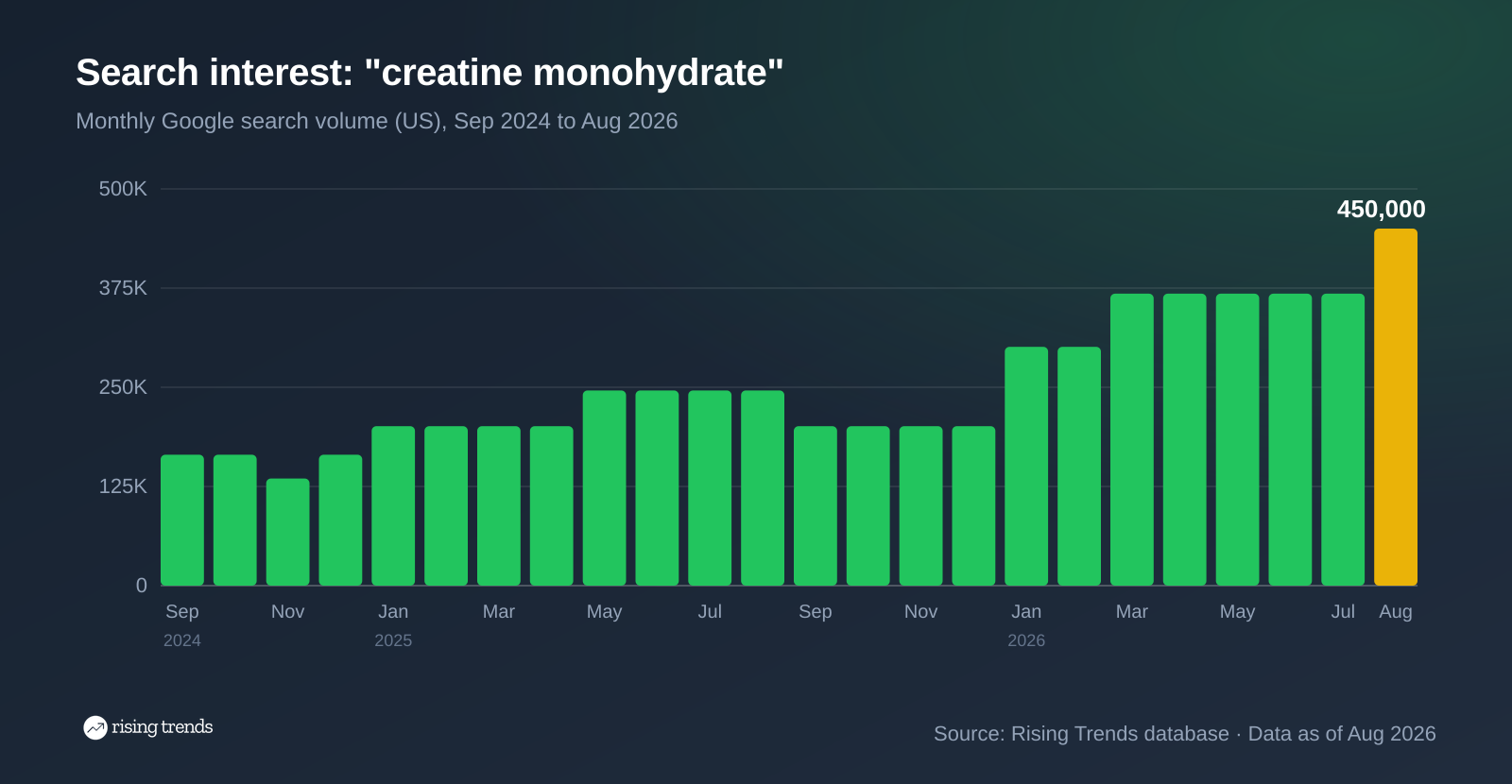
Two things are visible before any calculation. The series is stepping upward. And the two tallest jumps both land in January.
Now the central move. You have a line that goes up and down. Some of that movement repeats every year on schedule, and that part carries no information about direction.
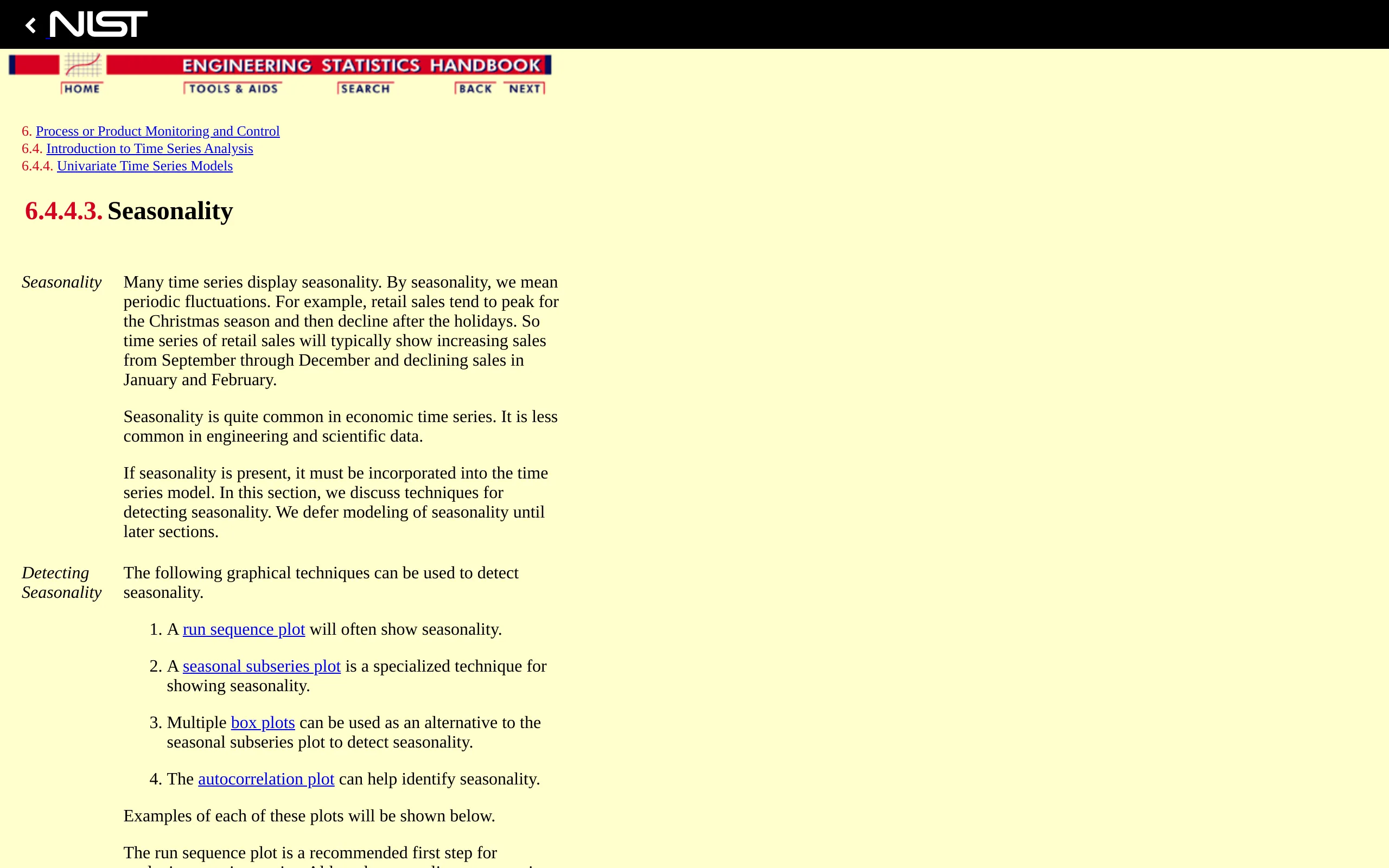
The quick visual test is to compare the same calendar month across years. NIST lists four ways to do this properly, the seasonal subseries plot being the specialised one, and the autocorrelation plot being the check when you do not already know the cycle length. For monthly data with a real annual pattern, the autocorrelation plot shows peaks at lag 12, 24 and 36.
This is not an academic nicety. It is what national statistics offices do before publishing anything. The US Census Bureau builds and distributes X-13ARIMA-SEATS, the seasonal adjustment program behind a great deal of official economic data, precisely so that the published direction is not just the calendar.
Run the test on creatine. Every January is up on the December before it:
| December | Following January | Change |
|---|---|---|
| Dec 2022: 110,000 | Jan 2023: 165,000 | +50% |
| Dec 2023: 110,000 | Jan 2024: 165,000 | +50% |
| Dec 2024: 165,000 | Jan 2025: 201,000 | +21.8% |
| Dec 2025: 201,000 | Jan 2026: 301,000 | +49.8% |
Four years, same direction, similar size. So the January jump is seasonal. If someone had sent you a chart in January 2026 saying creatine searches "grew 50% last month", they would have been describing New Year's resolutions.
But look at the left column again. The December figure itself goes 110,000, 110,000, 165,000, 201,000. The seasonal floor is rising. That is the trend, and it is the part you can take to a meeting. A series whose quiet months keep getting louder is growing. A series where only the peaks grow is just getting more seasonal.
While you are here, learn to recognise the third component. Matcha monthly search volume reads 1,000,000 in July 2026, with June and August both at 823,000. The same single-month bump happened in May 2025. One month above its neighbours that returns to the level either side is noise, not a turn.
There is no single trend analysis formula, which is why pages promising one are vague about it. There are three calculations that cover almost everything, in increasing order of effort.
Period-over-period change. The percentage change between two points, which is (new - old) / old x 100. Honest only when you pick the two points to cancel the season, which means the same month a year apart.
Creatine, August 2025 to August 2026: 246,000 to 450,000. That is +83% year over year. Two years back, August 2024 was 165,000, so +173% over two years. Both figures compare like with like, so neither of them is a January artefact.
A moving average. Average each point with the months around it to flatten short swings. A twelve-month moving average on monthly data removes the annual cycle almost entirely, at the cost of lagging real turns by about six months.
Decomposition or a fitted line. Split the series into trend, seasonal and residual components formally, or fit a straight line by least squares and read its slope. This is where the software earns its keep, and where Minitab's warning matters: their Trend Analysis procedure expects a trend with no seasonal component, and if you have seasonality you want Decomposition or Winters' Method instead. Running the wrong procedure gives you a confident number that is wrong.
For most business questions the first calculation, done properly, is enough. Year over year, same month, stated with its date. Magnesium glycinate for sleep is at 673,000 monthly searches as of August 2026, up 235% on the year. That sentence contains the metric, the level, the direction, the period and the as-of date, and someone can check it.
A growth figure in isolation still does not tell you whether to act. +83% is either excellent or disappointing depending entirely on what the rest of the category did.
So take four or five comparable series and rank them. Same category, same period, same metric.
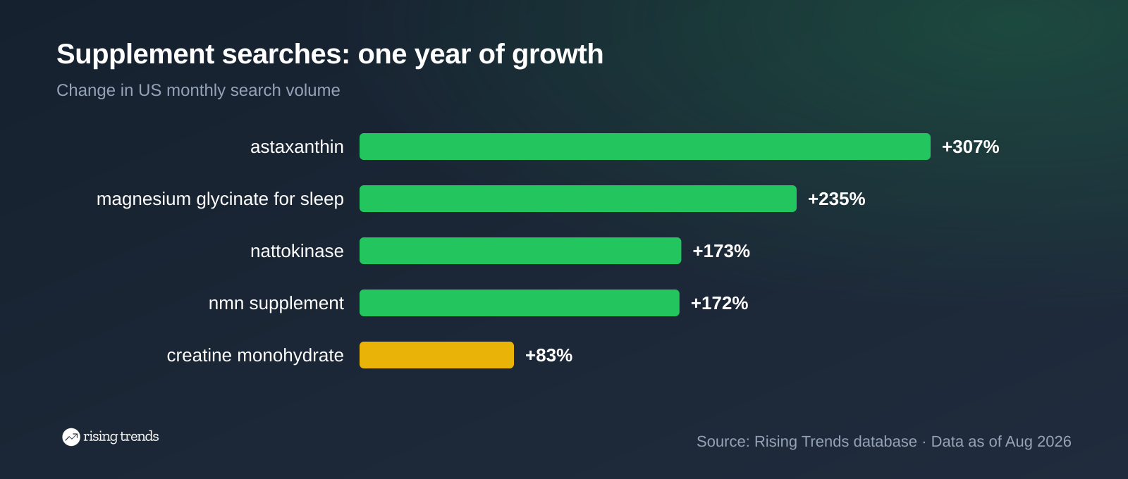
Creatine is the slowest grower on its own shelf. Astaxanthin added 307% in the same twelve months on 301,000 monthly searches. That reframes the whole analysis: creatine is a large, maturing term in a category where attention is moving to newer compounds. Neither fact is visible from the creatine series alone. Our supplement trends page keeps the wider category list, which is the usual place to find peers.
This is also where you sanity-check the level. A term growing 400% from 2,000 searches is a different proposition from one growing 80% from 400,000. Growth and size are two separate columns, and a trend analysis that reports only one of them is half an analysis.
Now the counter-example, because a method that only confirms good news is not a method.
Run step 2 on pickleball. Plot the whole series.
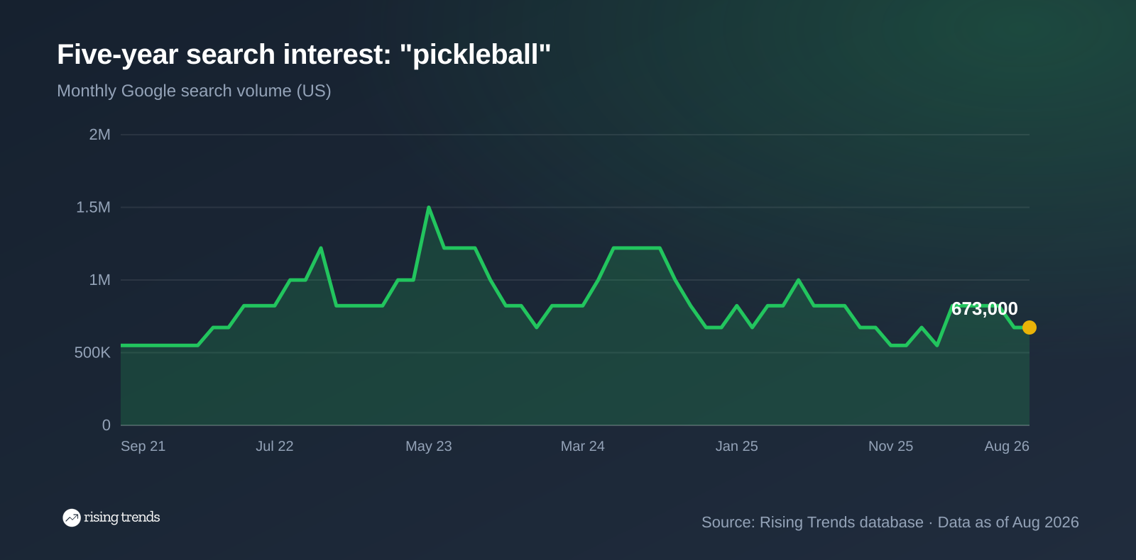
The shape answers the question before any arithmetic. Pickleball search volume peaked at 1,500,000 monthly searches in May 2023. August 2026 is 673,000, which is 55.1% below that peak. There is a large peak behind us, and the recent section of the line is lower than the one before it.
Step 3 is where this gets interesting, because the series still produces impressive-looking jumps. February 2026 was 550,000. March 2026 was 823,000. That is +49.6% in a single month, a number any dashboard would highlight in green.
Compare the same month a year apart and it evaporates. March 2025 was also 823,000. Year over year, that month is flat. The spring jump happens every year in this series, summer peaks and November to December troughs included, because pickleball is played outdoors. The 50% was the season.
Step 4 confirms it: -18% over one year, -45% over two. And step 5 adds the nuance that keeps you honest. The term is still 2.7x its March 2019 level. The level is high and the direction is down, which is exactly the situation where level-based reporting misleads people for years.
The method follows the shape of your data, not the other way around.
| Your series | Use | Why |
|---|---|---|
| Clear trend, no seasonality | Fitted trend line, or linear regression on time | Gives a slope and a simple forecast |
| No trend, no seasonality | Moving average or single exponential smoothing | Separates real shifts from random variation |
| Seasonality, with or without a trend | Decomposition or Winters' Method | Models the cycle instead of letting it distort the slope |
| Trend with shifts or reversals | Double exponential smoothing | A dynamic trend component handles the turns |
| You just need the direction | Same month, year over year | Cancels the season with no model at all |
The last row covers more real business questions than the four above it combined.
Match the interval to the data. Monthly series get re-checked monthly, and only the year-over-year figure is worth reporting. Checking a monthly series weekly produces movement, not information.
If you are tracking more than a handful of terms, the manual version stops scaling quickly. The Rising Trends API returns the same volume and growth columns as a scheduled query, so the ranking in step 5 can run itself:
curl -H "Authorization: Bearer rt_live_..." \
  "https://www.risingtrends.co/api/v1/trends?category=Vitamins%20%26%20Supplements&timeframe=1y&min_growth_pct=100&min_search_volume=10000&sort=growth&order=desc"
That is step 5 as a cron job: one category, one timeframe, ranked by growth, with a volume floor so small terms do not crowd the list.
The creatine example above is a complete one. One series (monthly US searches for "creatine monohydrate"), 94 months of history, a plot showing an upward staircase, a seasonal check finding a January spike in four consecutive years, a year-over-year measurement of +83% from 246,000 to 450,000 between August 2025 and August 2026, and a ranking against four other supplement terms that put it last on growth. Conclusion: real long-run growth, maturing, with the category's momentum moving elsewhere.
Pick one series and get enough history. Plot the whole thing. Separate the trend from the seasonal pattern and the noise. Measure the direction the same way every time, year over year for monthly data. Rank the result against comparable series so the number means something.
Time series analysis is the statistical name for the broader field. In accounting, running the same comparison across periods of a financial statement is called horizontal analysis. In market research it is usually market trend analysis. The procedures overlap heavily.
By direction, three: upward, downward and horizontal. In accounting the three are horizontal analysis (the same line item across periods), vertical analysis (each line as a share of a total) and ratio analysis. Which trio someone means depends on whether they are looking at demand or at financial statements.
Descriptive (what happened), diagnostic (why), predictive (what is likely next), prescriptive (what to do) and exploratory (what is in here at all). Trend analysis is mostly descriptive, and it becomes predictive the moment you extend the line past the last observation, which is where it gets unreliable.
For one series, a spreadsheet is genuinely fine: a chart, a column of year-over-year changes, a twelve-month moving average. For decomposition and model fitting you want a statistics package such as Minitab, R or Python with statsmodels. For search demand specifically the constraint is the data rather than the software, since you need absolute volume with several years of history per term. Our walkthrough on tracking market shifts covers how that fits into an ongoing research routine.
To tell a durable shift from a fashion before committing budget to it. The pattern is the one above: take the search terms that describe a behaviour, measure each year over year, and look at whether the seasonal floor is rising across the family rather than whether one term spiked. Our guide to finding profitable niches with Google Trends applies the same logic to picking a market to enter.
Want the method applied to a market rather than a single term? Read our guide on how to identify market trends, open the live nattokinase trend page, or see what is moving this week on the Rising Trends dashboard.
Thousands of Emerging Trends
Thousands of Breakout Apps
Mega Trends
Trend Analysis Tool